Jefe's Ramen

project overview
Jefe’s Ramen is a brand that feels both energetic and comforting, built around the idea of ramen that tastes like hustle and feels like home. Inspired by Manchester’s creative culture, the identity was designed to feel bold, playful, and full of personality, while still keeping that sense of warmth and familiarity that makes people want to come back.
project type
Brand Identity & Campaign
year
2025
my role
Creative Director & Brand Designer
client
Jefe's Ramen

Visual Identity
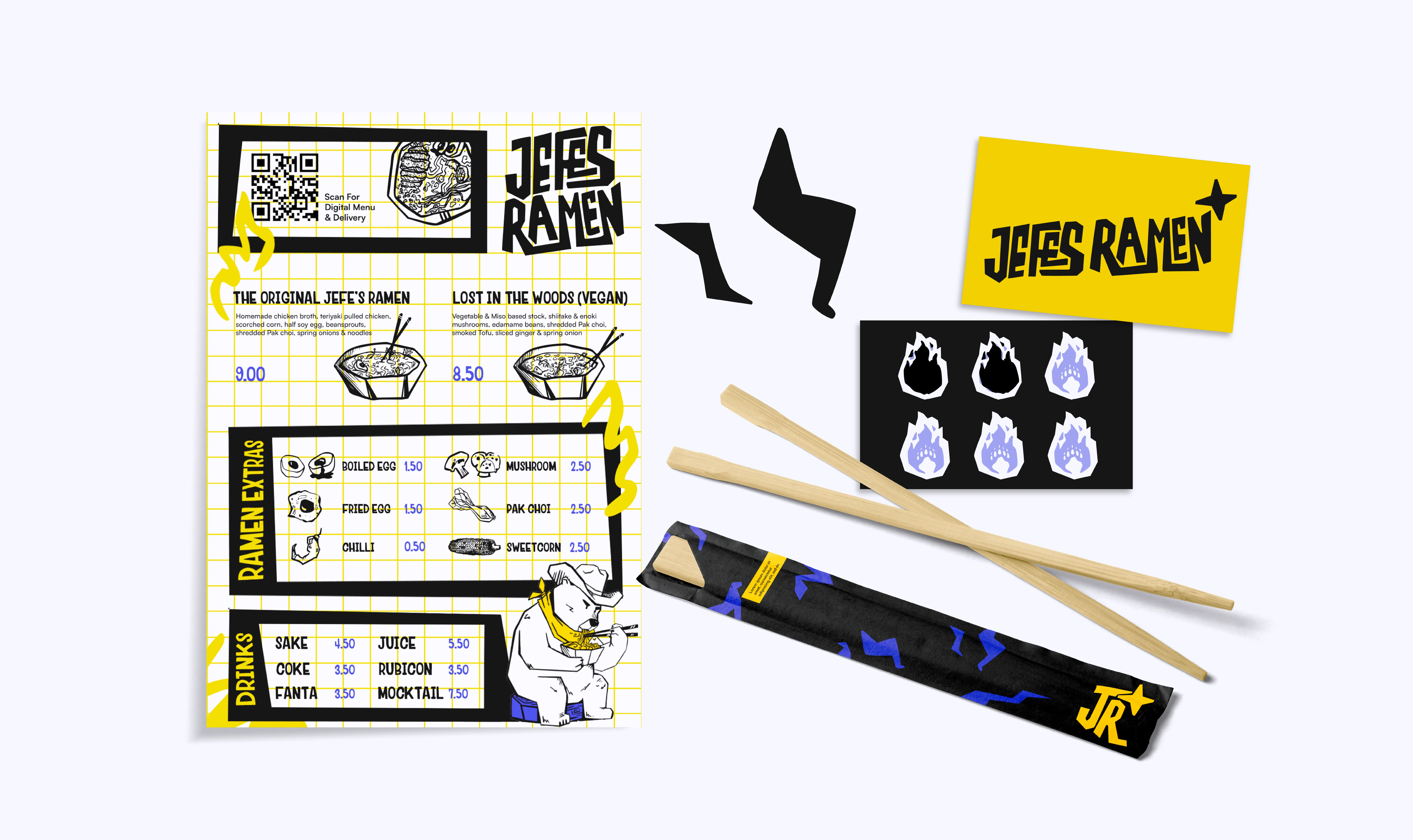
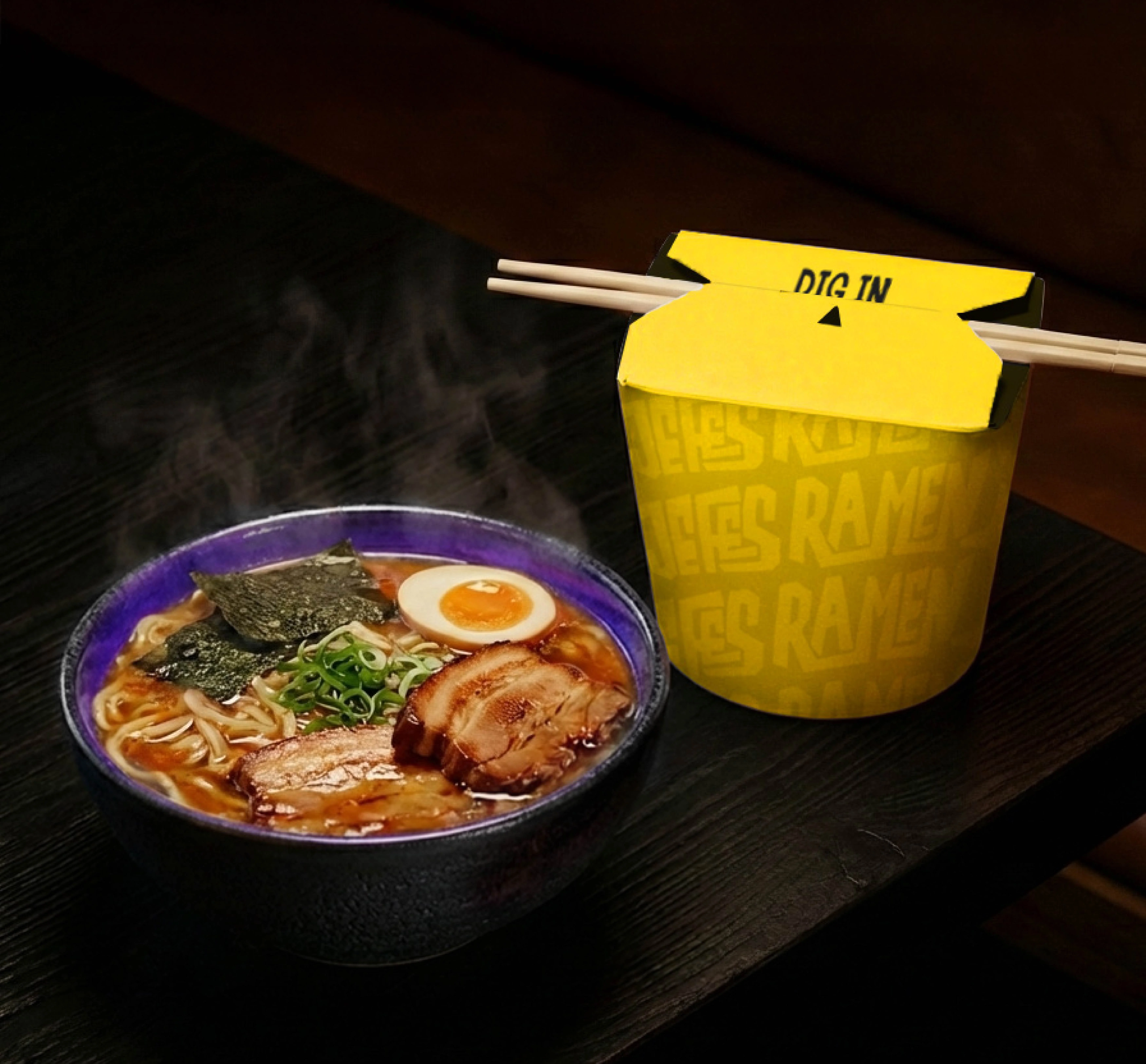
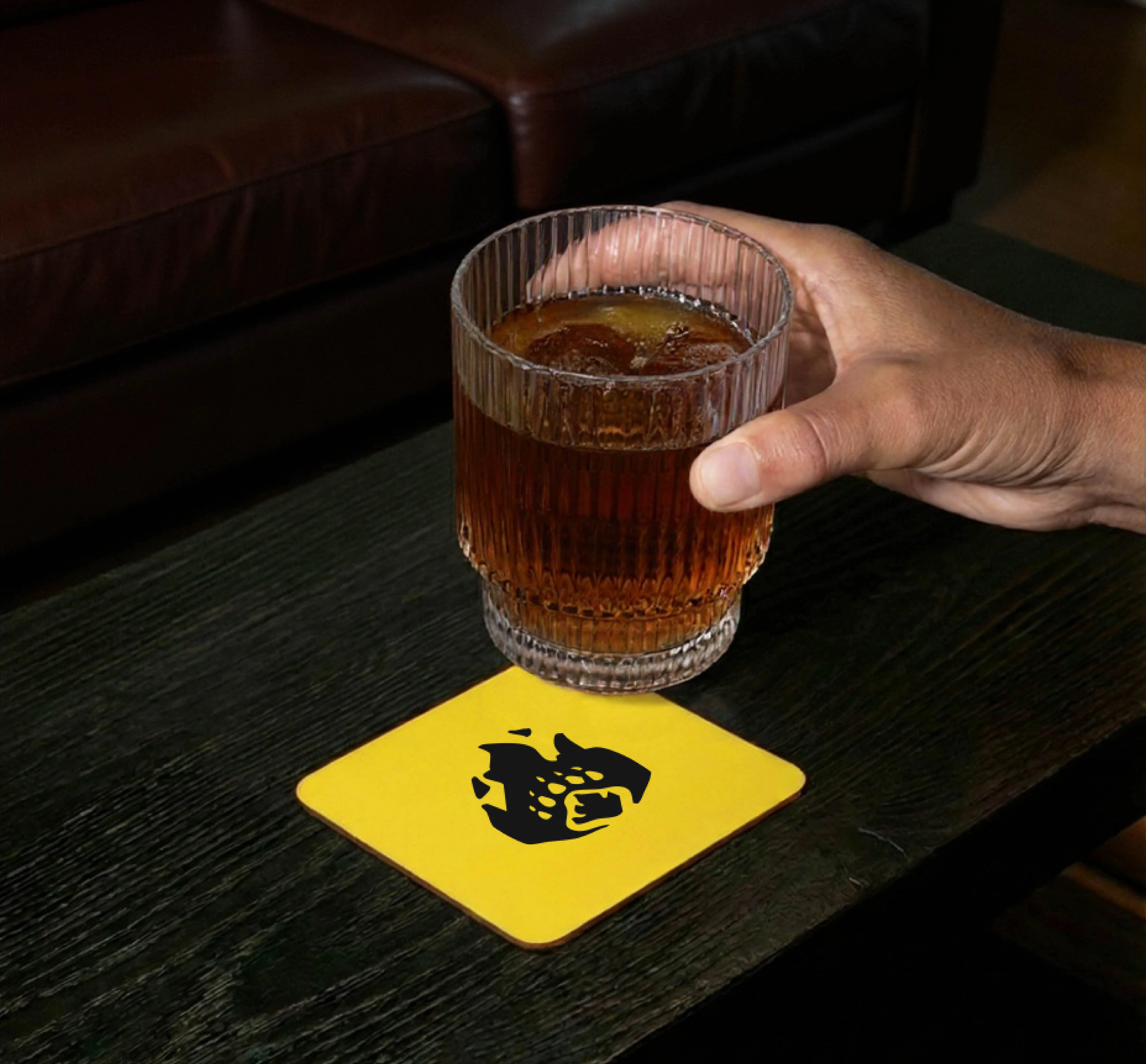
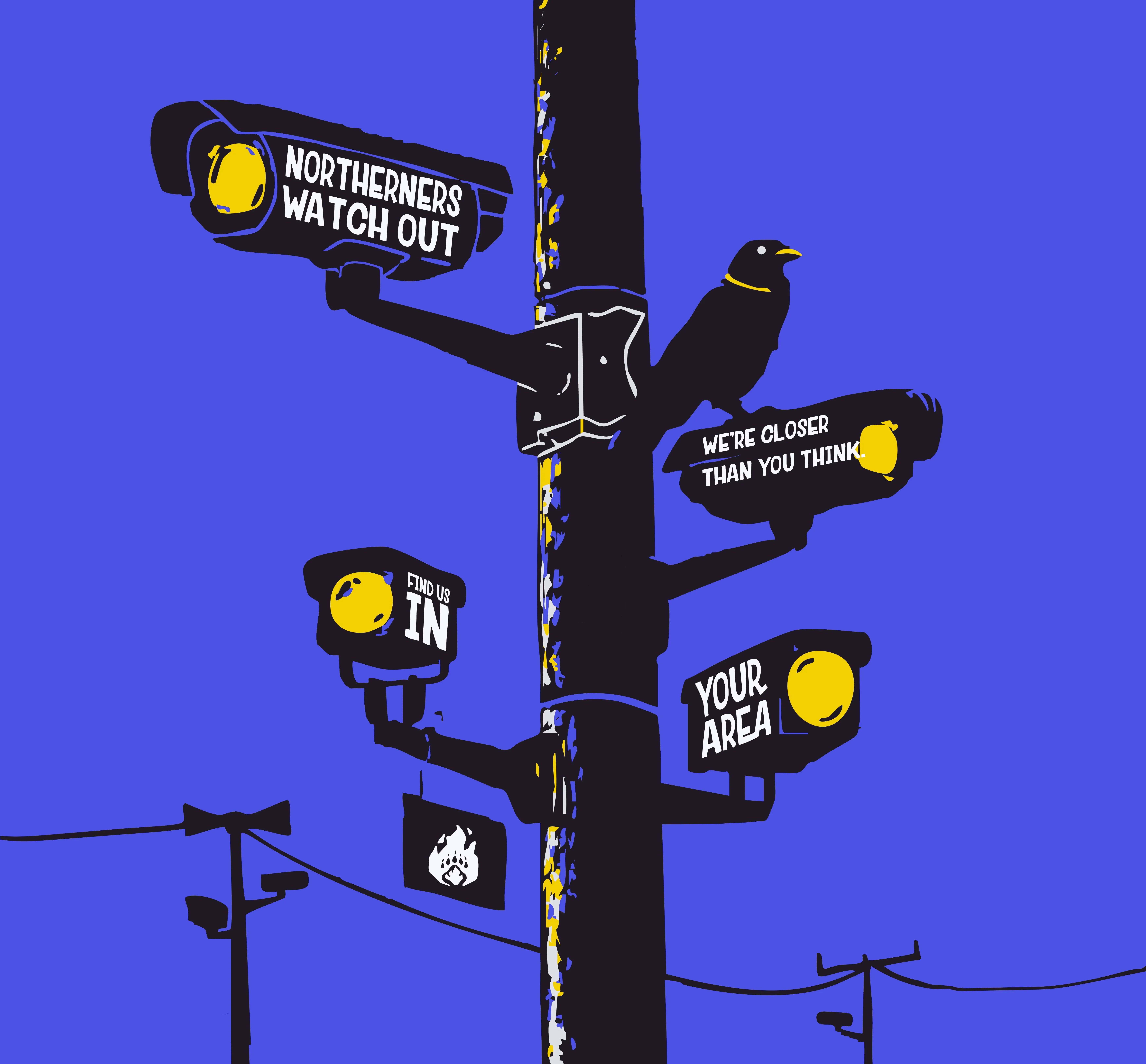
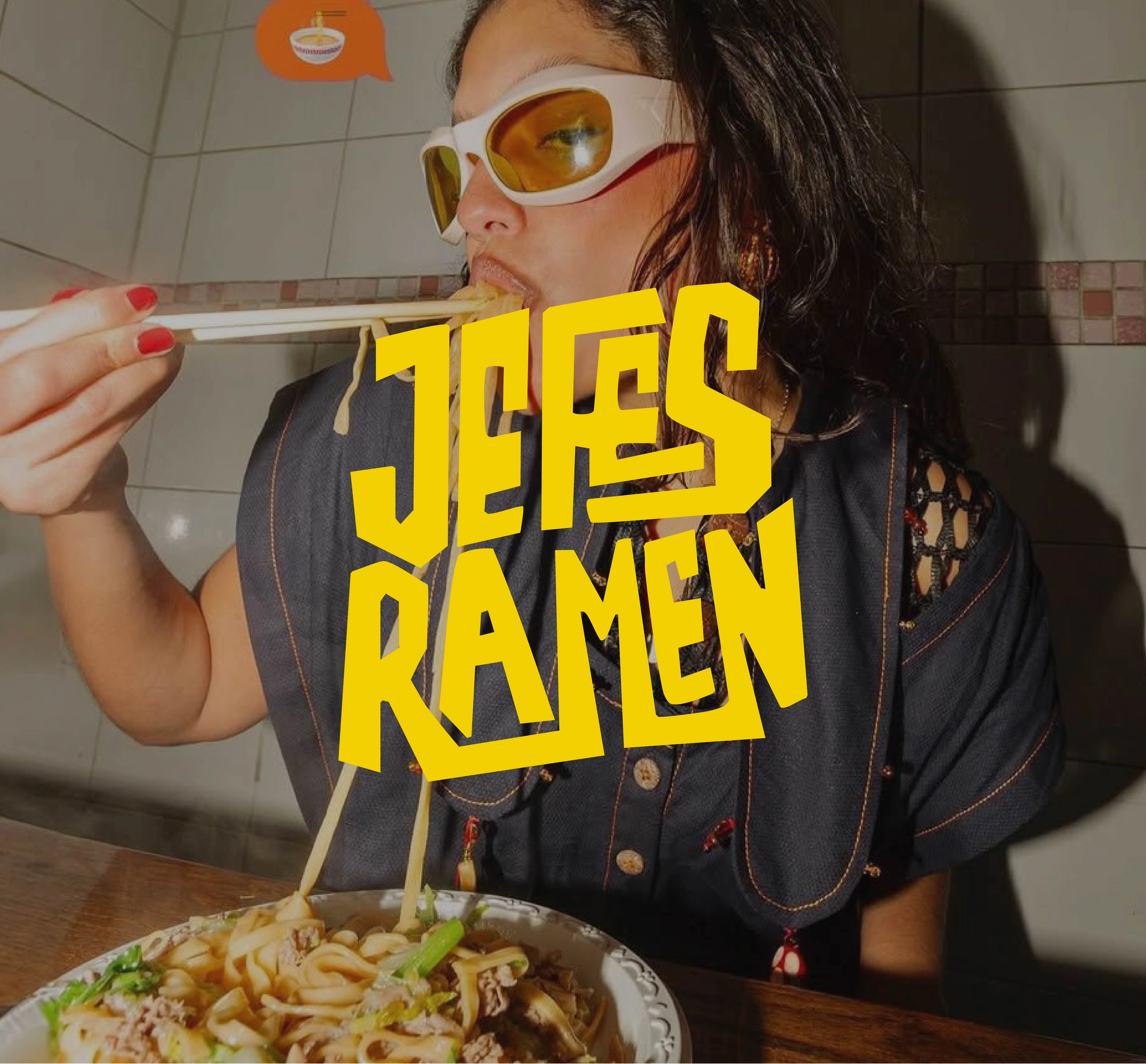
The visual identity was built to feel loud in a confident way. A bold yellow brings warmth and optimism, the near-black grounds the brand, and the electric purple adds an unexpected hit of energy that gives it an after-hours edge. Paired with confident typography and a graphic style that feels clear and impactful, these choices help the brand stand out while still feeling approachable.


Character & Brand World
A big part of the identity is the bear character, which gives Jefe’s Ramen a recognisable face and adds more personality to the brand world. It stops the identity from feeling too serious and opens up more room for storytelling across posters, packaging, social content, and campaigns. The wide graphic system turns the brand into something more immersive, expressive, and community-driven.

Final Outcome
The final outcome is a brand that feels full of life, character, and confidence. Jefe’s Ramen goes beyond just selling food, it creates a world around it. One that feels cheeky, comforting, and rooted in culture, with enough personality to grow into something much bigger than the plate.


