Even & Oats

project overview
Even & Oats reimagines oats as something exciting, expressive, and full of life. Instead of following the usual muted and overly wholesome look often seen across the category, this identity brings a bold, premium energy to breakfast, making the product feel as vibrant and flavourful as the ingredients themselves.
project type
Brand Identity & Illustration
year
2025
my role
Brand Designer
client
Competition - The Brand Journal


Identity System
The logotype reflects the natural flow of nature and the richness of the flavours, creating a wordmark that feels both confident and full of character. Alongside it, the icon takes inspiration from the shape and figure of oats, giving the brand a distinct visual cue that is simple, memorable, and easy to recognise. Together, they create an identity that feels refined, playful, and rooted in the product itself.
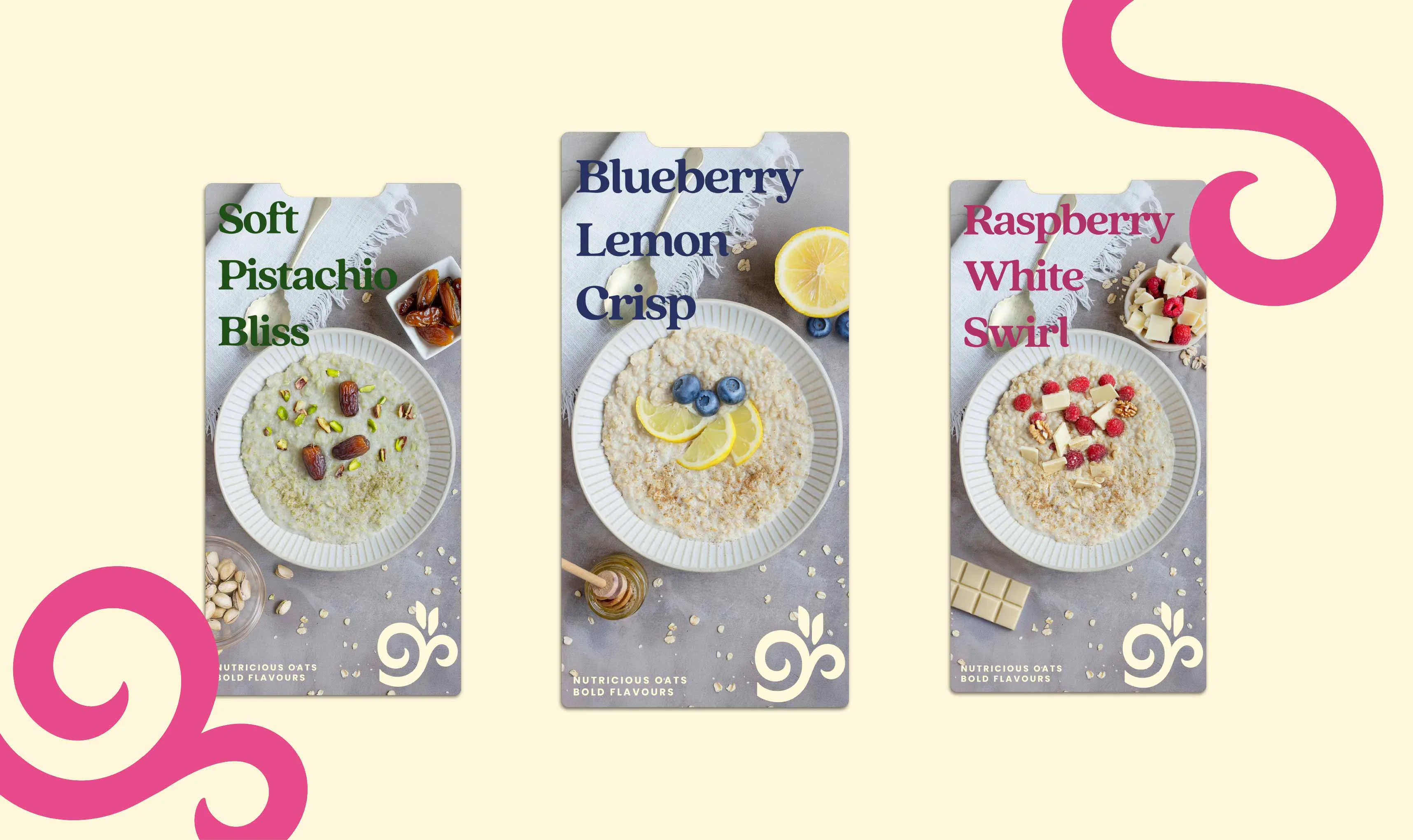
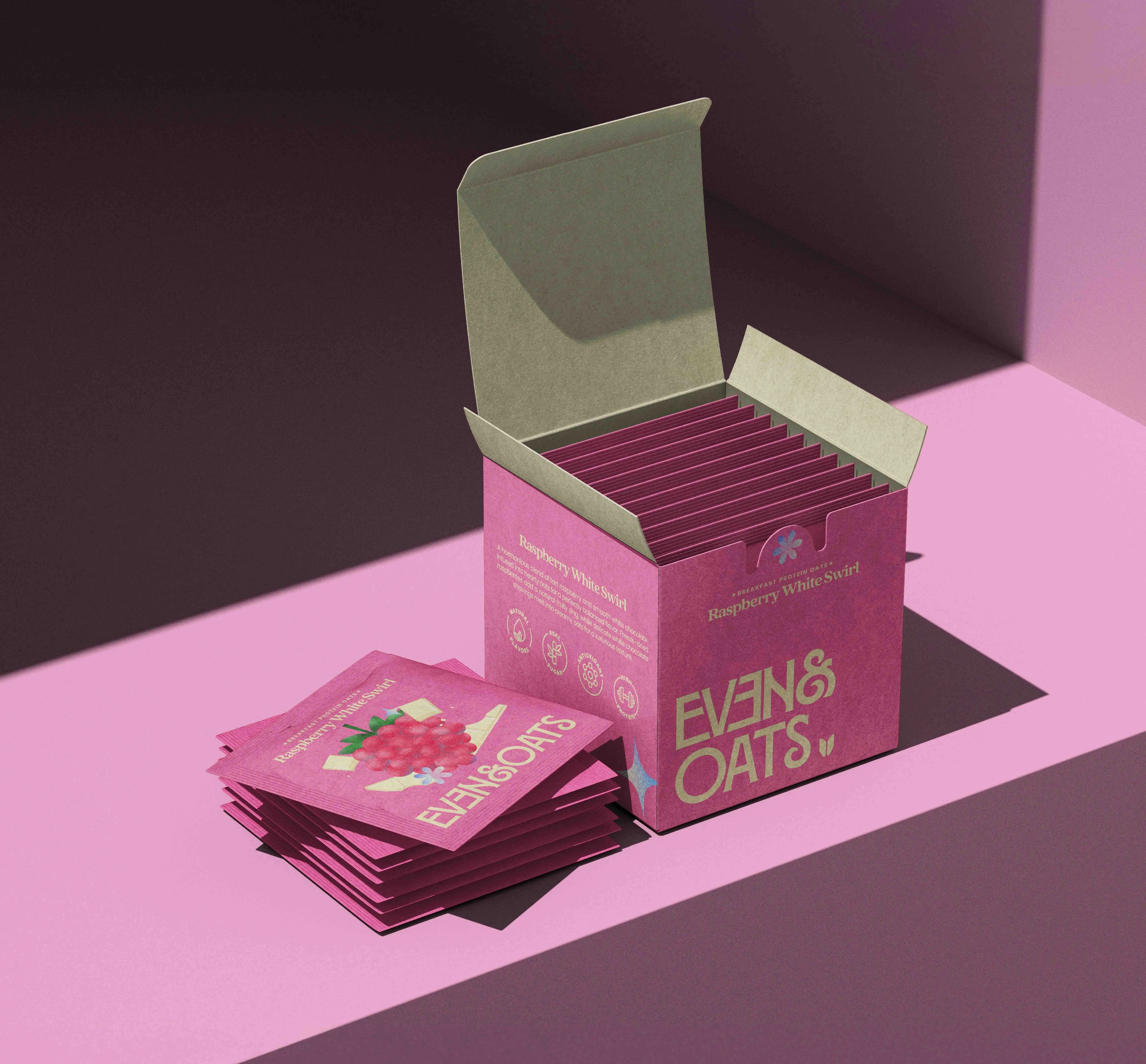

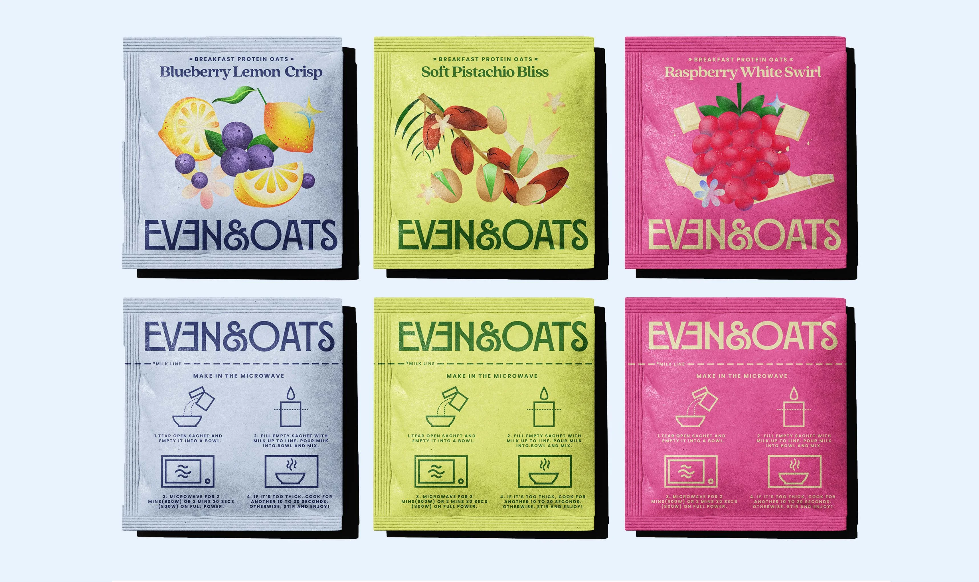
Illustration & Packaging
The colour palette was designed to feel bright, bold, and energising like a burst of flavour in the morning. It helps the range stand apart on shelf and break away from the muted or serious visual language often seen in the market. Handcrafted illustrations introduce a natural softness, bringing the ingredients to life with freshness and personality. The packaging carries this through, giving each flavour its own vibrant presence within a cohesive brand world.


Final Outcome
Through packaging and wider brand applications, Even & Oats becomes a playful yet polished identity that stands out on shelf and feels instantly memorable. The project shows how thoughtful branding can shift perception, transforming oats from something ordinary into something people feel genuinely excited to pick up.


